 It's Saturday October 17th, two days before the 2015 Tableau Conference in Las Vegas. I'm not packed, I haven't picked all the sessions I want to attend yet and I realize my Tableau vizzing has been...well...not existent the last couple of months. The dashboards I made with my team were in production and I started on a new project at work focused on data migration and architecture, less so on visualization (for now). I decided I needed to grease the wheels and play to get back into Tableau mode. To be honest, I didn't have a particular question in mind or a story I wanted to tell. I just wanted a data set that required minimal prep work so that I could get to vizzing. I ended up coming across Jewel Loree's data feed on "Inside Airbnb". The source of the data, Inside Airbnb, hosted a collection of Airbnb data for cities around the world. The best part for me was that the data had already been analyzed, cleansed and aggregated where appropriate. Perfect! As a new resident of the San Francisco Bay Area and customer of Airbnb I immediately grabbed that data set and naively went about creating my dashboard without any attention to the story that was brewing in the media, in courtrooms and likely cities near you...
But first, the viz!
Sorry for the cut off - still figuring this out! I'll eventually figure out how to widen my panel. If anyone has other recommendations, let me know!
Design
- I created a custom color palette by copying an image of their logo from a google search into MS Paint and then used the dropper to get the RGB values. I know, high tech. Next, I used the Palleton color scheme maker by inputting the color values into their web app. I then followed these instructions to import my custom palette into Tableau.
- I also saved a .PNG version of the logo which you see incorporated in the far right with the filter buttons. To do this, I imported a custom shape (the logo). Here's some clear instructions.
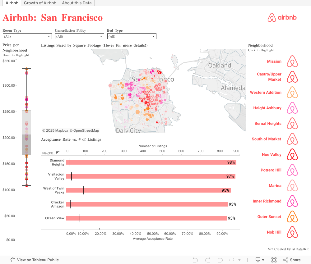
- My favorite visualization on this first dashboard is the box and whisker plot (here's how). It tells you a lot of information and takes up minimal real estate. See Tufte's Data-Ink ratio. You can see the distribution in rental costs across the many neighborhoods of San Francisco. The line in the middle shows the median price ($205.71). The lighter shaded top part of the box is called the upper quartile ($251.04). The darker box on the bottom is the lower quartile ($165.98). The data points extend to the top and bottom whiskers. These data points represent the lowest and highest observations.
Tip: you can right click the axis and customize your box and whiskers (mine here show the defaults).

Source
In this data set, you can see Pacific Heights average rental cost is $331.68, much higher than the median. The lowest average rental prices are observed in Visitacion Valley at $108.11. If you highlight this neighborhood on the map you'll notice it's on the far south eastern side of San Francisco further from the tourist spots. Interestingly enough, this neighborhood has the 2nd highest number of listings. What about Pacific Heights? Why does the rental cost much higher there? According to the the internet/Wikipedia:
It is located in one of the most scenic and park-like settings in Northern California, offering panoramic views of the Golden Gate Bridge, the San Francisco Bay, the Palace of Fine Arts, Alcatraz and the Presidio. Its location provides a temperate micro-climate that is clearer, but not always warmer, than many other areas in San Francisco.
Ah, okay. Makes sense.
- This dashboard also features a dual axis where I am showing the # of listings and the acceptance rate per neighborhood. Here's Tableau's guide to how to make a dual axis. The version in the screenshots is ancient at this point but the steps remain true. I like to sort my bar charts in descending order, most importantly in this case because my chart is scrolling down so without a sort you can't see the top data points clearly. I also think it makes more logical sense when I'm trying to pinpoint the highest or lowest values of a dimension. I also like to sort this in descending by number of listings. Isn't Tableau wonderful? Many times when I use dual axis I synchronize the axis. But, since the formats were different I kept the default and made sure to add a label. For the number of listings I used a Gantt Bar to show the number of listens relative to the acceptance rate.
- As far as the map, nothing fancy there. The data set already contained the latitudinal and longitudinal values for the the neighborhoods. I made my marks circles, colored by neighborhood, sized by the size of the rental (in square feet), set the color transparency to 83% and threw a bunch of dimensions on the tool tip card. I made sure to edit the tool tips to continue the color scheme and branding. I always feel this makes the overall visualization look very polished too!
- To make the logo button filters on the right I simply put my neighborhood dimension on the row shelf, changed the marks to shapes and updated the default shape to the image I imported earlier. Then, through the use of dashboards actions I enabled the worksheets within the viz to speak to each other.
- The global filters at the top are pretty standard. Something I like to always do it customize them to include the "Apply Button".
This is the second dashboard of what I published and I was so shocked to see that the first dashboard had over 6600 views yet the second one only...30. Wow, I am a bit bummed folks missed this one because it starts to tell the real story of this data! This could be a lesson to me that I should use Tableau's story points next time! Anyways, after I made the first dashboard I looked back on the site Jewel linked to where I actually downloaded the data. I realized in my haste to get the data I didn't pause to actually read the intent of Inside Airbnb. They provide the data so that, "you can see how Airbnb is being used to compete with the residential housing market." Hmmm, interesting. I decided to take a look for myself and that was the driver of this view.
Design
First, the map. This one I love. I wanted to show the growth of Airbnb in San Francisco over time. On my desktop version it loops through automatically but I noticed when I published you have to manually click the carrot to move through each year. :( Anyone know why that is or how I can fix that? Anyhow, pages create a separate chart for each value in the field and enables you to cycle through them almost like a slideshow. It's really easy to do and works really well with use cases such as this one. So my map viz just contains the longitude and latitude on the columns and rows shelf respectively. I used the circle mark and then dropped the room type to color. Then I dragged my Year pill to the Pages shelf and voila. You'll see the page shelf activate and just like other Tableau menus, you can right click and customize. I chose to loop the playback but unfortunately that didn't show on the published version. It's amazing to see how saturated the city is now and to see it grow so quickly over the last 7 years. The purpose of coloring on the room type this time versus the neighborhood is to show that most of the listings are for the entire home.
Next, let's look at this more clearly with the bottom line chart. You can see shared rooms weren't even an option until 2011. The highest growth was for the entire home/apt. I thought it was interesting that it was climbing very quickly but then something happened in 2014 and the growth of those listings slowed. Hmm, why? Well it turns out that's the year the city legalized and started regulating these types of short-term rentals, see here. So what does that mean? Well, it means new town ordered limits to hosts, fees, registering your rental with the City Planning Department, hotel taxes, liability insurance, rent control laws and penalties for not abiding by these laws. Sounds like a lot of hassle and risk, right? You can still see growth from 2014-2015 but just not as sharply. I would probably add a comment about this around that data point if I were doing it again.
The table on the right (sorry you'll have to open the viz in a new tab!). Alright, I know Tableau isn't meant for tabular displays of data but it does have the word Table in it's name, right? I normally do not use crosstabs. But in my haste and to conserve space I did. I wanted to show the number of listings by host and how many days per year they are available. This is important to the debate. The anti-Airbnbers argue that wealthy real estate mogels profit from this service and that it exacerbates the affordable housing crisis. You should watch some of their campaign videos a bit over the top IMHO. Anyways, this data could support this claim. I don't know anyone who has that many properties. Also notice that most of them are available all year or close to 365 days out of the year.
The parameter over the table controls the number of rows you see in the table and is tied to the number of listings the host has. I made this because there were over 4000 hosts and the point was in really looking at the top hosts by number of listings. In hindsight, I would either remove this and only show the top 25 or limit the sliding scale more. The key to making the parameter work for me was creating a calculated field I called Filter Top N: [Rank]<=[Select Top 'N' Value] I then dragged that to the filter shelf and selected "True" so the visualization would only show data points that were in the Top N selected value.
The last stylist thing I did was the logo border. I wanted to add some pizzazz but it doesn't do anything for the data so best practice wise, a no no. You can tell I put more time in the design of the first dashboard and ran out of time with this one but I believe this one starts to bring more visibility to the true story behind the data.
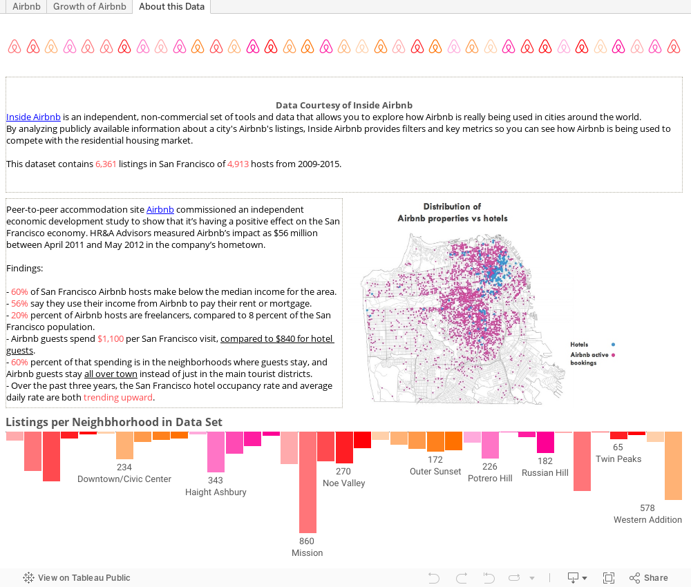
This last tab is meant to act as more of a bibliography if you will. I always feel it important to credit sources of information. I also wanted to end by beginning to share two sides of the story. This dashboard has had less then 10 views but I strongly urge you to look at the details here! I posted some info on a study Airbnb commissioned and another visual showing Airbnb listings compared to hotel listings.
I could continue on but if anyone is still reading this post I am sure I've really pushed the limits of your attention span. In my next post I will discuss the politics and data behind the shared economy debate and Airbnb!
I'd love to hear your feedback. As a new blogger please let me know what you liked or didn't like about the post and what you'd like more of! :)
Great explanation of a great viz! Congratulations.
ReplyDeleteI can relate to your story..much like my own...need to get back into vizzing and be more public about it. I'm also wrestling with Blogspot as well, so I feel your pain :-(
Good luck!
Thanks, Chris! I appreciate the feedback. Best of luck in continuing the blog and publishing more to public!
DeleteHey Brit, great post and lovely viz. I'm very happy to see a new bloger on the scene after the conference. I particularly like the second tab of your viz, you are right it should have more views, and your color palette is really pleasing to the eye! The growth shown with pages might be a good opportunity to use a GIF for animation like Jewel shows here http://www.jewelloree.com/2015/10/26/data15-pimp-my-viz-2-electric-boogaloo-follow-up/
ReplyDeleteSome Blogger advice - to change widths, go to Design, then Layout, then follow the hyperlink to Template Designer, then Adjust Widths (lots of clicks!).
One small piece of viz advice - when using a dual axis chart, try to add something to the label to show which axis is which - you this by just writing 'Average Acceptance Rate (pink bars)' for example.
Looking forward to your next post!
Hi Peter, thanks for the feedback! I'm going to look into the GIF route for animation. And, labeling the dual axis more clearly, I don't know why I didn't think to do that! Thanks, I will remember for next time.
DeleteDarn, due the the blog template I'm using (imported from the web) I cannot adjust the widths in blogger's widgets. I'll have to figure it out in the HTML.
DeleteThat is really good post, you have written it beaufully nd in a understandable way. Thank you for sharing it with us and keep posting
ReplyDeleteGood Post! Thank you so much for sharing this pretty post, it was so good to read and useful to improve my knowledge as updated one, keep blogging…
ReplyDeleteTableau Online Training
I can relate to your story..much like my own...need to get back into vizzing and be more public about it.
ReplyDeleteHi Dear,
ReplyDeletei Like Your Blog Very Much..I see Daily Your Blog ,is A Very Usefull For me.
You Can see also my services..Airbnb Property Management Service In Melbourne
Goodhouse provide airbnb property management service in Melbourne. Your home is in safe hands, Guest vetting, identity checks & checks after every clean.
Visit Now - http://goodhouse.com.au/